

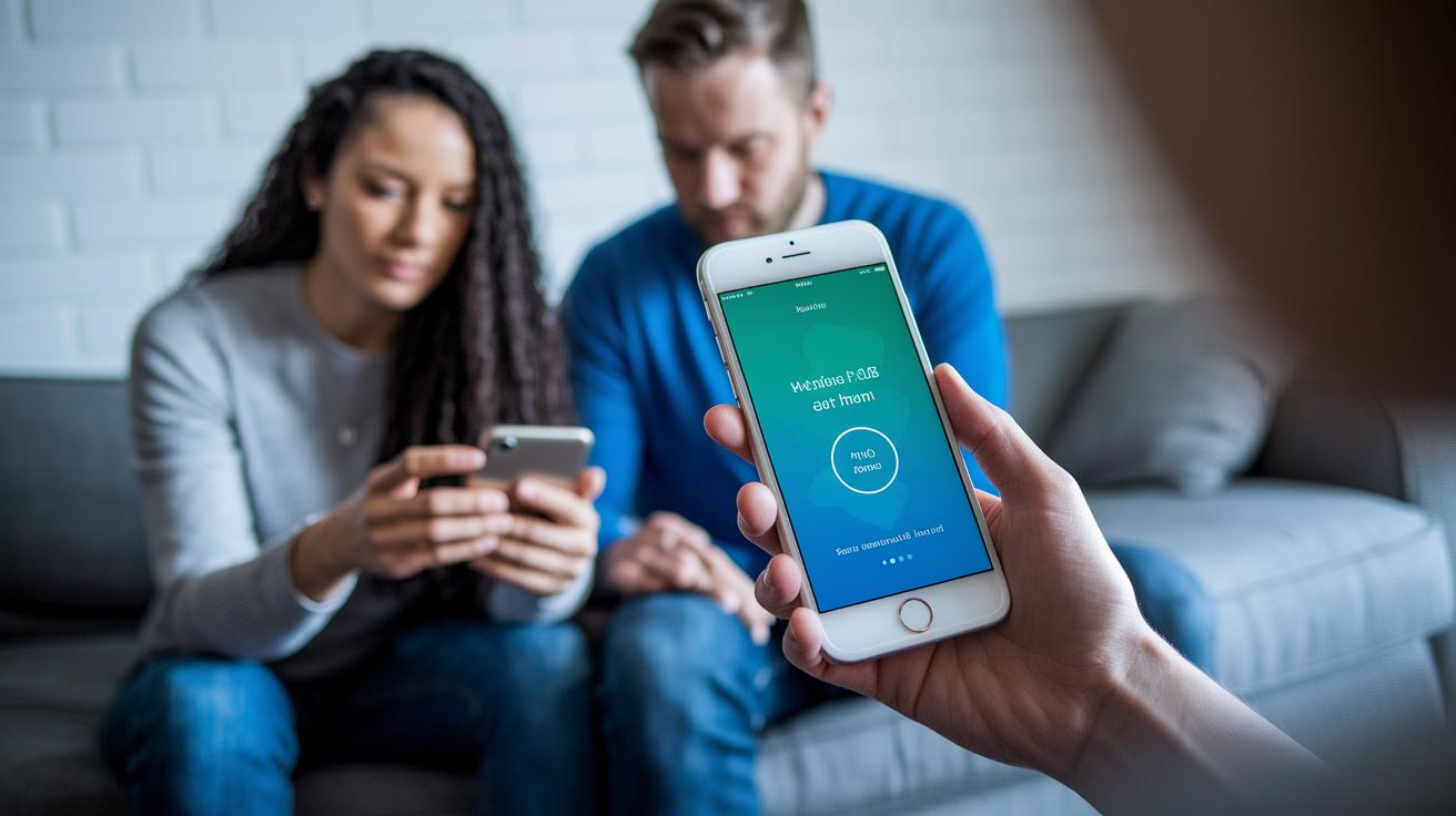
Have you ever felt the gentle calm of a few taps on your health app, like a friend's warm smile? When you can check test results or schedule a doctor's visit without any fuss, everything just feels right.
This write-up shows how smart design builds real trust and makes managing your health feel easy. With a clean layout and secure handling of your information, these apps help you take control of your well-being and stay truly connected.
How Health App User Experience Shapes Patient Engagement and Trust
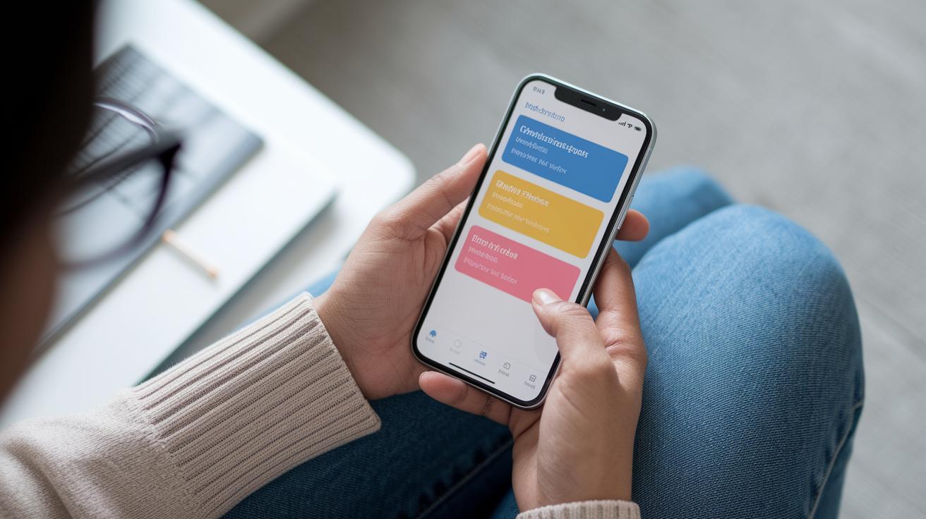
Good user experience in a health app builds trust and encourages patients to stay engaged. When an app safely manages important details like test results, doctor visits, and medicine times, you feel more secure using it. A design that lets you do key tasks in three taps or less is especially helpful for those who aren’t super comfortable with technology.
Imagine opening an app and seeing a clear menu that makes scheduling appointments and setting up medication reminders a breeze. It feels like a friendly guide that takes away stress and confusion. Every little detail, from simple fonts and clear labels to colors that stand out, aims to make you feel at ease and in control.
By focusing on easy navigation and strong security, health apps become a trusted space for checking your health information. This kind of design not only builds trust but also makes you want to come back often to manage your well-being.
Defining Performance Metrics in Health App User Experience
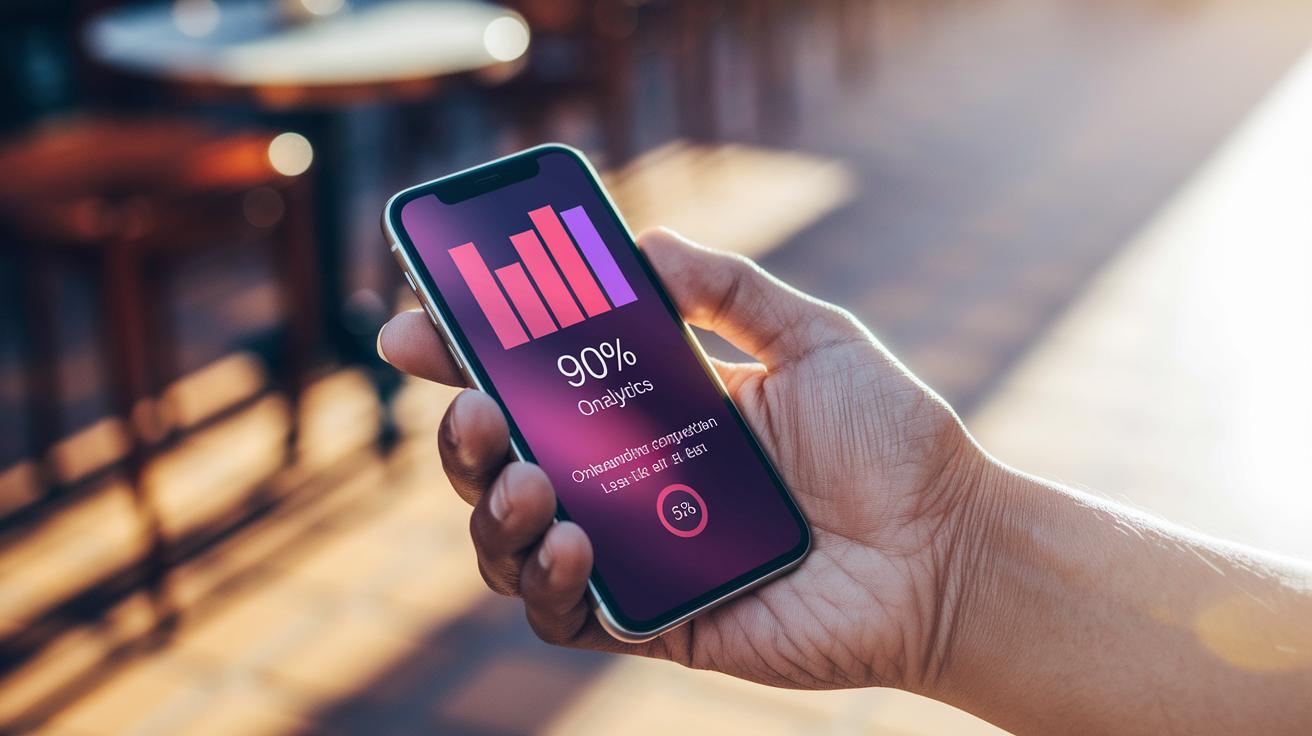
Measuring a health app's success starts with clear numbers that show how easy it is to use. One useful measure is the time to first action. This tells us how fast a person starts using the app, and our goal is under five seconds. Next, we look at the task completion rate. This number shows how many users finish key actions, with over 90% being a good sign. We also keep an eye on user mistakes, aiming to keep errors below 5%. Finally, session length tells us how long people stay active in the app, with a typical session lasting between three and five minutes. In truth, examples from Teladoc Health and MyChart show that keeping steps simple and using clear visuals can make a big difference.
| Metric | Definition | Example Benchmark |
|---|---|---|
| Time to First Action | The time it takes a user to begin using the app | <5 seconds |
| Task Completion Rate | The percentage of users that finish essential actions | >90% |
| Error Rate | The frequency of mistakes made during use | <5% |
| Session Length | The average time a user stays engaged | 3–5 minutes |
Using these clear numbers, designers can make the app even better for everyone.
Key Usability Factors in Health App User Experience
A good health app feels smooth and puts you first. From the moment you open the app to booking an appointment, everything should feel as clear as following simple directions. Picture this: you tap a clear menu and get your task done in three taps or less. Fast, neat, and user-friendly.
Let’s break down six important points:
-
Intuitive Navigation: Think of it like straightforward menus that get you where you need to go quickly. For example, one tap on a button could take you straight to scheduling your appointment.
-
Onboarding Efficiency: Create a short, interactive welcome journey that spans three to five screens. And if you’re already familiar with the app, you can easily skip the tour.
-
Visual Hierarchy: Use bold, high-contrast colors along with an F-pattern layout to make sure the main actions pop. It works like a clear roadmap where the important paths are easy to spot.
-
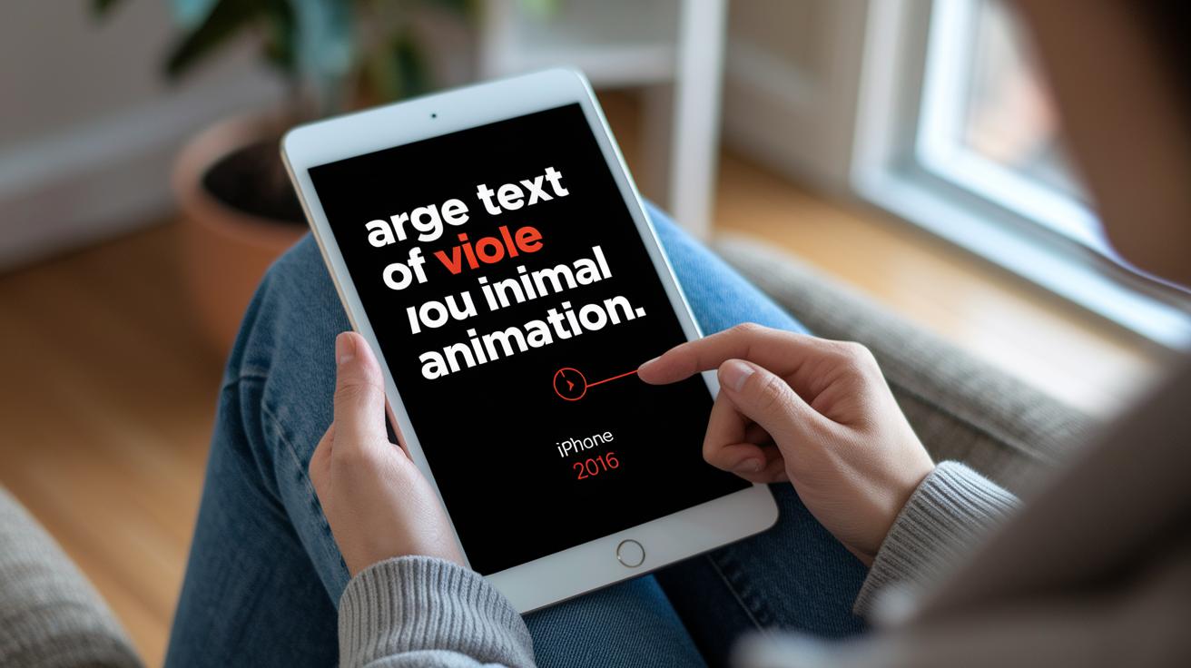
Typography Standards: Pick fonts that are at least 16 px in size and use high-contrast text. This makes reading easy and helps you quickly absorb the information.
-
Animation Control: Keep things simple with minimal animations. A subtle glow on a pressed button is enough to guide you without causing distractions.
-
Localization: Tailor the design for different languages by adjusting text length and formatting details like dates and currencies. This way, everyone feels at home using the app.
Each of these elements helps create an app experience that’s natural, welcoming, and secure, a real partner in managing your health.
Accessibility Strategies for Inclusive Health App User Experience
When you're building a health app for everyone, it helps to really focus on things like font size, color choices, and flexible layouts. Using large fonts, at least 16 pixels, makes sure that text is easy to read for anyone who might have trouble seeing. Bright color choices help separate the background from buttons and links, which can make the whole app feel clearer and easier on the eyes. Plus, adding voiceover and voice control means users can tap into the app hands-free, which is a big help if they have trouble with sight or hand movement. And really, keeping animations to a minimum avoids overwhelming the user.
Next, try to follow these simple ideas:
- Test the health app on different devices to see how it works for everyone.
- Check against ADA standards to make sure your app meets accessibility guidelines.
- Look over your design on screens of different sizes so the layout stays clear.
- Add clear labels and straightforward navigation so users of any age can get around easily.
- Let users adjust settings like font size or contrast.
- Keep every action simple and easy to understand.
These tips can build trust and help users focus on their health rather than wrestling with a confusing interface. When you weave these accessibility features into your app, you turn it into a resource that truly welcomes everyone. Inclusive design means more confidence and a longer-lasting connection with your users.
Iterative Testing Procedures for Health App User Experience Refinement
We frequently test our health apps in real-life situations. We invite healthy individuals, people managing chronic illnesses, and older adults to use the app in everyday settings. This way, we catch different ways people use the app and spot any little issues.
We keep track of simple numbers like how quick it takes for someone to tap their first button, how many mistakes happen, or if users stop filling out a form. For example, if more than one in four people leave during sign-up, that's a clear shout-out for a fix. We also use in-app surveys and quick feedback options to hear what users think immediately. One person said, "I loved how quickly the button reacted when I tapped it, it made scheduling my appointment so easy."
And we don't stop there. We also try out A/B testing, where we show two different versions of a screen, like the doctor selection page, to see which one helps reduce mistakes. Tools such as heat maps and session recordings let us see exactly where users slow down or get lost.
| Testing Cycle | What We Learn |
|---|---|
| Iterative Testing | We keep refining until our targets are met. |
| User Feedback | Real comments guide our design tweaks. |
| Real-Time Analytics | We pinpoint exact areas needing improvement. |
Step by step, these methods help us make every update smoother and more intuitive. Pretty neat, huh?
Security and Privacy Considerations in Health App User Experience
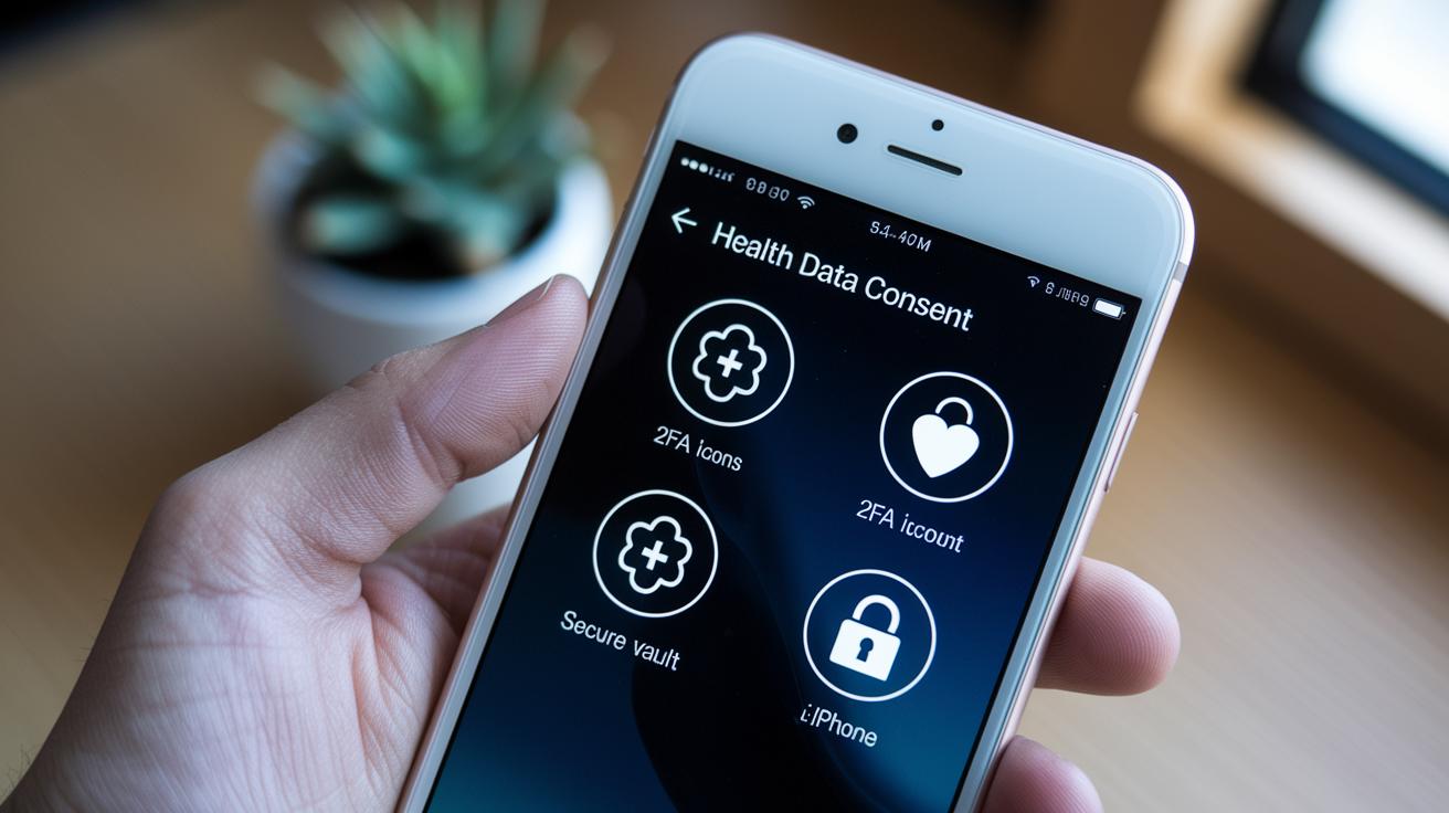
Keeping your health data safe doesn't have to slow down your app experience. Health apps need to stick to HIPAA and GDPR rules, which means they only collect what is necessary and explain exactly how your data is used. For example, clear consent forms show you exactly what information is being shared.
Designers should make it easy for you to delete or save away your personal data, like holding the keys to your own secure file cabinet. And by adding two-factor authentication, such as SMS checks or simple tools like Face ID and Touch ID, the app gets an extra layer of protection while still feeling smooth to use.
Next, smart features like automatic logout timers and turning off previews for sensitive notifications can really help. Separating private information onto its own screens also means you’re less likely to accidentally expose something personal.
In truth, a well-designed health app blends secure navigation with user-friendly privacy settings. This way, every time you interact with it, you feel both safe and supported.
Future Trends in Health App User Experience and Interface Personalization

Health apps are changing quickly, using smart technology to tailor content just for you. Imagine an app that knows your daily routine and greets you with a friendly, "Ready for your daily wellness check?" It's like having a personal coach right in your pocket.
Augmented and virtual reality are making therapy and rehab more engaging by letting you join in immersive exercises on your mobile device. These tools feel a bit like stepping into another world while still taking care of your health. And then there’s blockchain, which makes sharing sensitive health info safe and secure between different systems.
Voice-activated controls are making life even simpler. You can simply say, "Show my recent test results" and the app quickly brings up the details you need. Think of dark mode paired with a gentle haptic buzz, it not only eases your eyes in low light, but also gives you that extra, tangible connection with your device.
Wearable integration is getting stronger, too. Your smartwatch can now work seamlessly with your app to send real-time health updates that keep you in the know. And with tools like Figma or Sketch, designers are rapidly testing out fresh ideas to make your experience even smoother.
Picture this: you fill out a quick in-app survey, and the next update fine-tunes your dashboard based on your feedback. It’s a process that listens to you, making your health app more personal and engaging every day.
Final Words
In the action, we examined how health app user experience shapes care, from secure data practices to clean, straightforward designs that keep health information accessible.
Our discussion unpacked performance metrics, key usability factors, and methods to support every user, including those needing extra accessibility features. We explored testing cycles and privacy methods that build confidence with every tap.
Exciting trends in personalization promise more ease and engagement. The health app user experience continues to evolve in ways that brighten everyday wellness.
FAQ
Where can I find a comprehensive PDF on health app user experience?
The health app user experience PDF offers guidelines, examples, and best practices for intuitive design and secure navigation. It helps designers and developers build apps that boost patient trust and ease of use.
What were the key trends in health app user experience for 2021 and 2022?
The health app user experience in 2021 and 2022 focused on clear navigation, quick task completion, and secure data handling. These trends helped reduce errors and keep patient engagement high.
How does Figma support health app design?
The health app design in Figma simplifies creating interactive prototypes and testing layouts. It allows designers to craft user-friendly interfaces and make quick adjustments to improve usability and accessibility.
What do healthcare mobile app design templates offer?
Healthcare mobile app design templates offer pre-designed layouts that keep visual consistency and clarity. They help designers build apps that are easy to navigate, reducing user confusion while boosting patient engagement.
How is user interface design approached for healthcare apps using Figma?
User interface design for healthcare applications focuses on simple layouts, contrasting fonts, and easy navigation paths. Figma is used to build and refine these designs, making the app accessible and pleasant for patients.