

Ever felt lost using a health app that left you even more confused? Mobile health apps should be like a helpful friend, not a tricky maze.
In this guide, you'll discover how clear instructions and simple layouts can make managing your care details a breeze. Easy cues and step-by-step prompts show you exactly what to do.
Keep reading to find out why friendly health apps can really brighten your everyday wellness.
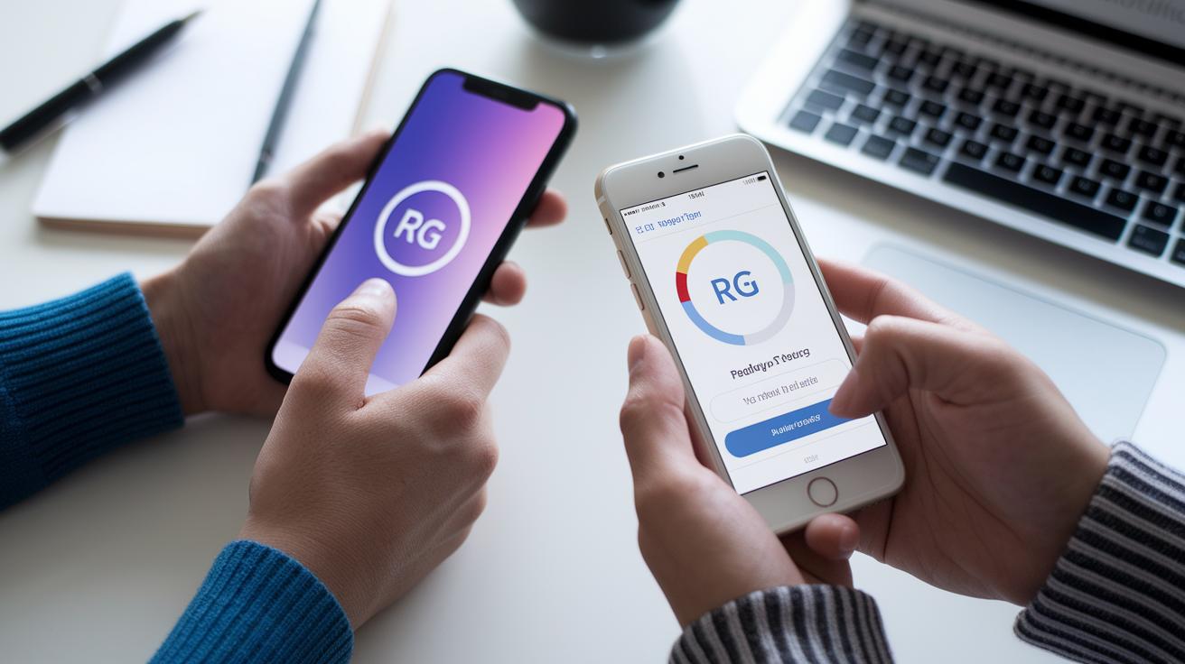
Key Guidelines for Designing User-Friendly Mobile Health Interfaces
Easy-to-use health apps are super important because they help build trust, especially when you're handling personal health details. A guide from August 4, 2025 explains that a well-crafted digital care screen can boost your confidence and get you involved, while confusing words, too much information on one page, or weak security can make you worry about your data.
Start by using clear messages that tell you exactly what to do. For instance, a simple instruction like "Tap to book your appointment" gives direct help and cuts down on confusion. This clear approach cuts out extra steps and helps you finish your tasks quickly.
Keep things simple for everyone, from tech experts to seniors. Try to let users finish the most important actions in three taps or less. Don’t hide key menus that hold the essential features. Imagine it like a short, easy tutorial that guides you step by step without any extra distractions.
Cut down on the clutter on your screen. Use as little text as possible, stick to clean layouts, and only spotlight the most important features. This tidy design not only saves you time but also makes decisions easier, just like checking off items on a simple to-do list.
Think about these tips:
- Use layouts that feel natural and easy to follow.
- Limit necessary taps to three for quick actions.
- Provide clear and engaging prompts to guide users.
- Keep security strong to protect your data.
By following these digital care interface tips, you create a health experience that feels personal and trustworthy. Every interaction becomes simple and clear, guiding you through every step with care.
Understanding Patient Needs in Mobile Health Interface Design

Designing a mobile health app with patients in mind means putting people first. Whether you're a busy doctor or an elderly patient, the goal is to create an experience that feels natural and intuitive. Think of it like this: seniors need bigger buttons and clear screens, much like a gentle reminder that guides their touch. Using ample space and clear labels can help everyone feel at ease and confident while navigating the app.
User research is key when building digital clinics. By gathering insights through methods like creating user personas (imagined sketches of typical users) and writing simple user stories, the design can mirror daily habits. For instance, creating a friendly persona for an older adult might reveal that a swipe-based tutorial can simplify navigation. Have you ever noticed how a clear, well-spaced button saying "Start your day" can bring a smile? It’s these small touches that help build trust.
Mapping the patient journey is another essential step. Early screens during onboarding, usually around three to five quick tutorial screens, set the tone with easy swipes and intuitive navigation options like going back or skipping ahead. This method ensures that even those who are not very familiar with technology can quickly feel comfortable with the app. By keeping these techniques in mind, developers and designers can create an interface that truly fits the real needs and routines of every patient.
Simplified Navigation and Workflow for Mobile Health Interfaces
Time is precious, especially when you're taking care of your health. Prebuilt flows let you complete important tasks in just three taps or fewer. So whether you're trying to schedule a visit or check your test results, everything feels simple. Imagine pressing a clear "Schedule a visit" button and achieving your goal in seconds.
Designers use F and Z pattern layouts to guide your eyes naturally. They arrange key options along the screen's flow so the most important choices catch your attention. And with pinned bottom navigation, primary actions stay visible even if you scroll, keeping things straightforward.
Limiting on-screen choices is a smart move. Instead of bombarding you with too many options, the interface shows only what you need at that moment. It’s like having a clear conversation where every step is precise and easy to follow.
Direct prompts such as "Tap here to get started" guide you to what matters most. This streamlined navigation makes the whole experience feel natural and effective, much like walking down a well-lit path.
Ensuring Accessibility and Inclusivity in Mobile Health UI

When building a patient portal, the goal is to make every element clear so everyone can easily understand it. Use a font size of at least 16 px and keep a color contrast ratio of 4.5:1 so that important details really stand out. Imagine an app with a big, easy-to-read "Book Appointment" button on a dark background, that’s a design that even users with vision challenges can quickly navigate.
Voiceover support is another great feature for those with visual or motor difficulties. For instance, the app might say, "Swipe right to access your records," giving helpful cues through sound. And if voice-control is available, someone could simply say, "Show my next appointment," and the app would respond right away. It’s a friendly, hands-free way to get things done.
Finally, remember to make your design work for everyone by supporting multiple languages. That means making room for longer translations, like in German or Finnish, and adjusting formats for dates, times, and measurements to match local standards. When every little detail is considered, each user can feel truly included and at ease with the app.
Integrating Security and Compliance in Mobile Health Interfaces
Health apps need to keep your private details safe while making everything simple. When apps follow rules like HIPAA in the US or GDPR in the EU, they tell you clearly what data they collect and why. For instance, you might see a neat little note saying, "This information goes to your secure profile." It’s all about keeping things transparent and easy to understand.
Secure access is super important. Imagine using a two-step verification process where you get a quick text or email, or even a simple tap using Face ID or Touch ID. That little tap makes sure that only you can unlock your account. It’s like having a tiny, friendly guard that keeps the bad guys out.
Privacy-aware features add another layer of comfort. For example, setting your app to log out automatically after a short pause keeps your data hidden if you step away. Sometimes, a pop-up might ask, "Are you sure you want to view this sensitive information?" before showing something private. Even if you forget to lock your phone, these smart steps work together to keep your info safe.
In the end, blending user ease with strong security makes the app feel both friendly and secure. By sticking to clear data policies and safe sign-in methods, every part of the app is made to protect you while still being easy to use. For more advice on keeping your data safe, check the information privacy guidelines provided by our experts.
Iterative Usability Testing and Optimization for mHealth Interfaces
Nothing beats real feedback when you're fine-tuning a mobile health app. Start by inviting a mix of patients to your sessions, those who are tech-savvy and others who aren't as used to smartphones. Watch closely how they interact with the app. If you notice that more than one in four users skips the registration process, that's a clear signal something might be confusing.
Keep an eye on the small details too. Think about the gentle buzz when you tap a button. Sometimes, a quick in-app survey might pop up, asking if the appointment button was easy to find. These little moments give you instant clues you can use right away.
Another handy trick is to run A/B tests with different layouts. For example, one version might show a fixed bottom bar for navigation and another might let your eyes follow a simple F-pattern. Recording these sessions helps reveal which design makes users feel more at ease.
Sometimes, a focused design sprint can really speed things up. In these sprints, small teams made up of designers, developers, and even patients work together to polish calls to action and navigation. This teamwork helps ensure the app feels genuinely intuitive.
In truth, ongoing testing means you’re always in tune with your users' needs. Every test is a chance to create an experience that feels natural, confident, and stress-free.
Case Studies of Successful Mobile Health Interface Designs
Teladoc Health shows how a smart app design can ease even the toughest moments. Their emergency support guides you through five easy steps. For example, you might see a prompt saying "Step 1: Verify your identity" followed by smooth load indicators that make the process feel fast and safe. It’s like having a caring guide right at your fingertips.
MyChart by Epic is another great example. Its layered layout helps you find what you need quickly. As you scroll through your dashboard, you can spot upcoming visits, test results, and health reminders with ease. It blends wearable technology with clear appointment flows, so you never feel overwhelmed by too much information.
Then there’s CareFor. This app emphasizes multilingual support and strong privacy. A clear "Access Privacy Settings" button lets you manage your data on your own terms. Its simple design supports different languages and builds trust by showing you that your privacy truly matters.
These cases highlight how thoughtful design makes a world of difference. With clear steps, easy navigation, and smart features, these apps are proof that managing your health can be simple and reassuring.
Final Words
In the action, we explored clear design guidelines that boost patient engagement and trust. We touched on meeting patient needs, easy-to-use navigation, inclusive layouts, and strong security measures. We even looked at real-life examples showing how simpler, smart steps can make a big difference. Each section helped us understand practical ways of designing user-friendly mobile health interfaces. There's a spark in each idea that can transform mobile health apps, making health management more accessible and secure. The future looks bright with these insights in hand.
FAQ
What are examples of designing user friendly mobile health interfaces from recent years?
The examples from 2021 and 2022 show mobile health interfaces that stress clear navigation, minimal on-screen elements, and easy task flows to boost patient engagement and trust.
How is user interface design applied to healthcare applications?
The user interface design for healthcare applications focuses on simple steps, clear calls to action, and intuitive layouts that help both tech-savvy users and seniors complete tasks efficiently.
What defines a good medical UI design?
The good medical UI design emphasizes secure, accessible features with straightforward interactions, reducing confusion and building user confidence when handling sensitive health data.
What are key principles of effective healthcare UI/UX design?
The key principles center on user-friendly layouts, limited tap steps, and prominent call-to-action elements that create a smooth, engaging experience for patients and clinicians alike.
How should patient profile and patient portal UI designs be structured?
The patient profile and portal designs should clearly display essential information, offer easy navigation, and support secure interactions so users can manage their health details with confidence.